Office Design,
Melchers China
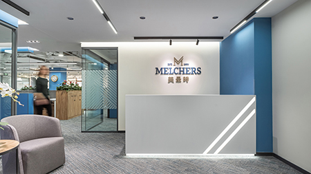
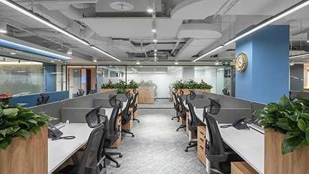
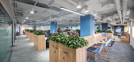
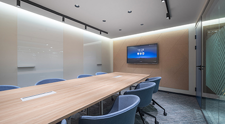
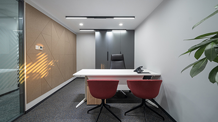
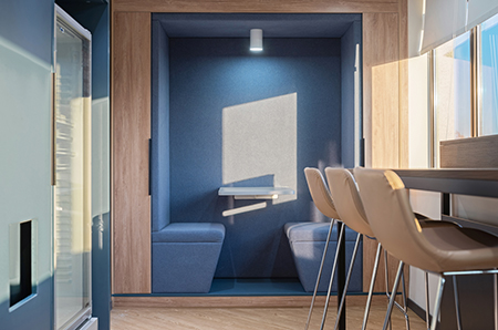
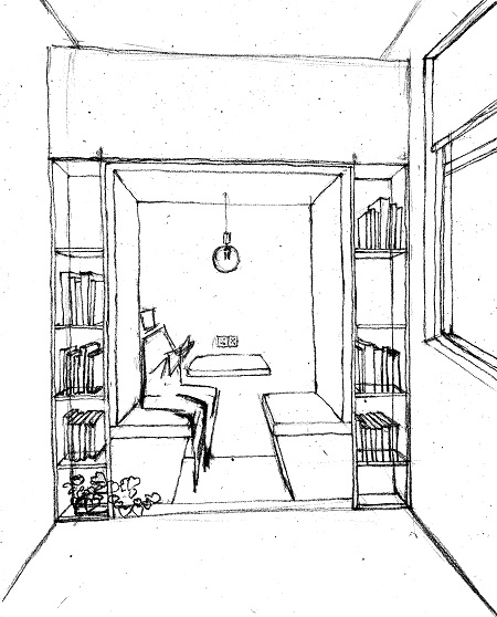
5 Star Plus Retail Design was assigned to re-design Melchers China’s existing office in Beijing and translate the brand’s new visual identity into a physical environment. Diagonal, clean lines that represent modernity and the speed of development are implemented across several elements: the reception desk, the pattern of the carpet, wall panels, and decoration of the glass walls. The gold and blue color scheme represent the more than 200 years of history of the company. The blue, in particular, represents the Melchers’ values of integrity, assurance, and loyalty, as well as diligence, growth, and harmony. The office design is a mix of formal as well as informal work and meeting spaces and includes a variety of niche and spacious areas to increase the well-being of employees. The three formal meeting rooms are named based on the cities where Melchers has its headquarters and important bases in China: Bremen, Hong Kong, and Beijing. The informal spaces have varied seating including café-style benches, round tables, and high tables, to encourage employee interaction and communication.
Back to Projects
